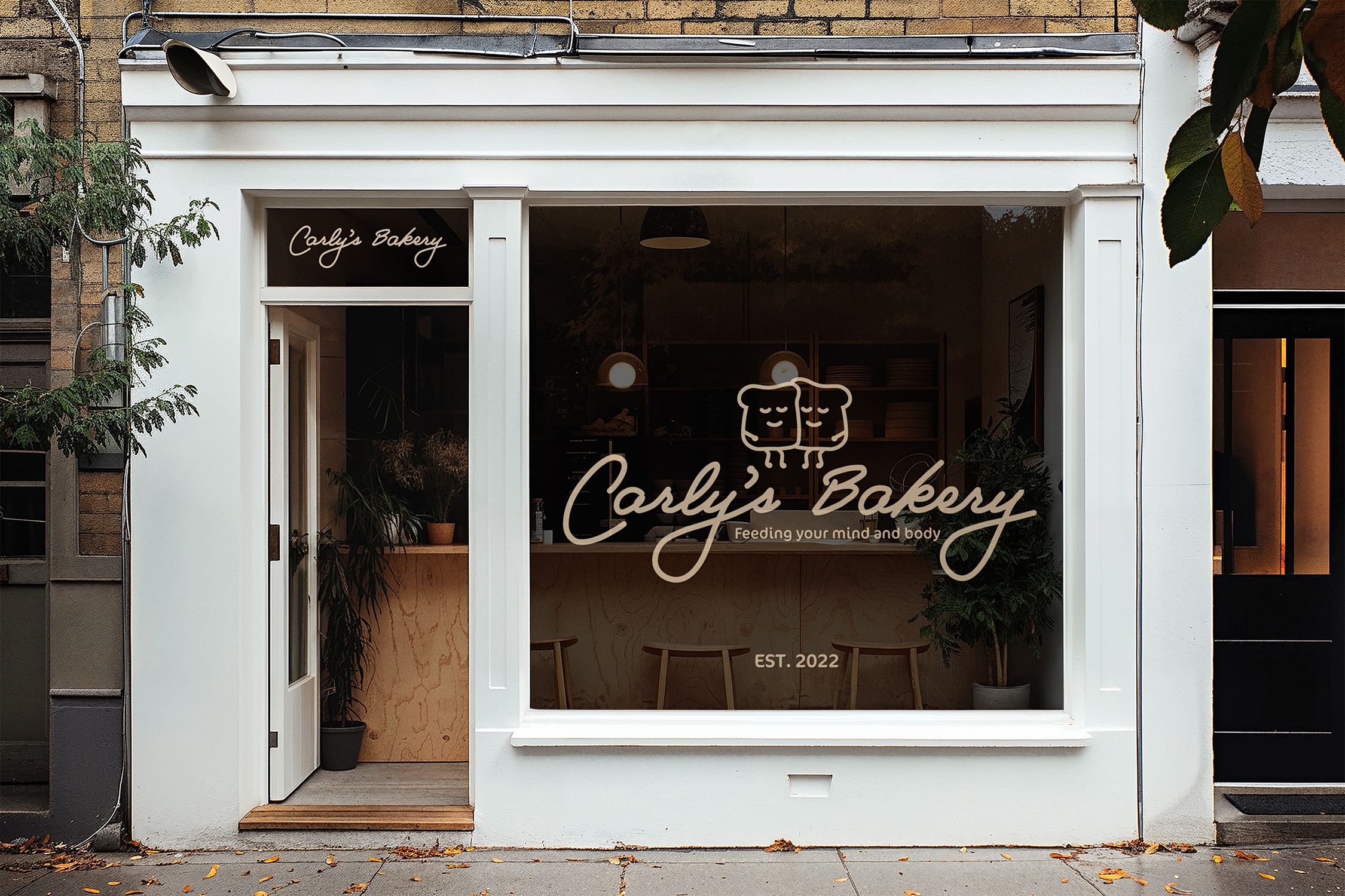
Carly’s Bakery

Carly’s Bakery
The concept for this 8-week project was to develop print materials for a B-Corporation of our own design. For context, a B-Corporation is simply a business for good. B-Corps have to meet specific guidelines set up and monitored by B-Lab. These businesses must prioritize the social good, environmental well-being, accountability, and transparency just as much as profit.
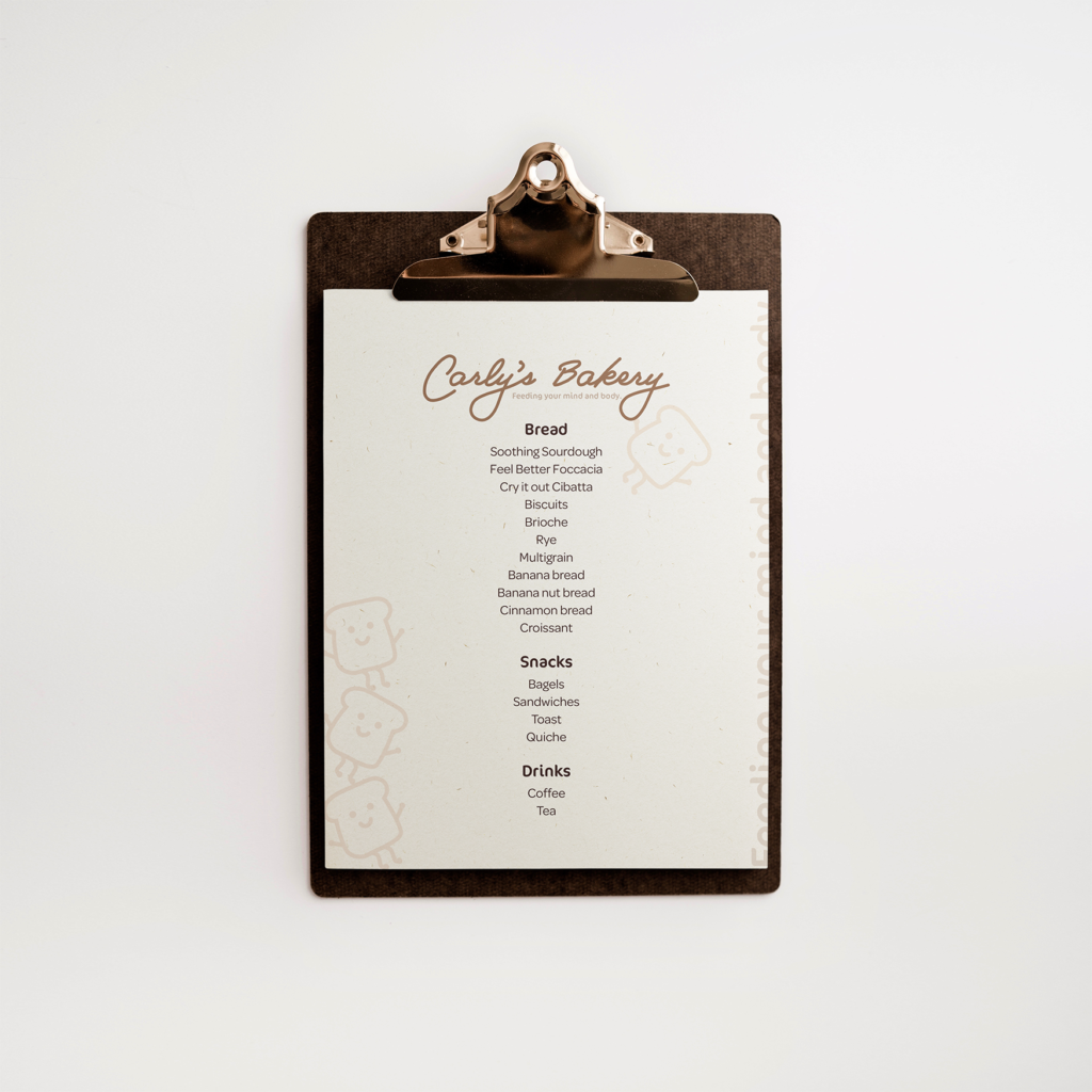
First, I developed the idea for the B-Corporation. I chose to brand a bakery which served bread as well as offered a safe space for those who need mental health resources or are seeking more information about the process. The goal was to create a warm and welcoming atmosphere that removed some of the pressure and stigma surrounding mental health care.
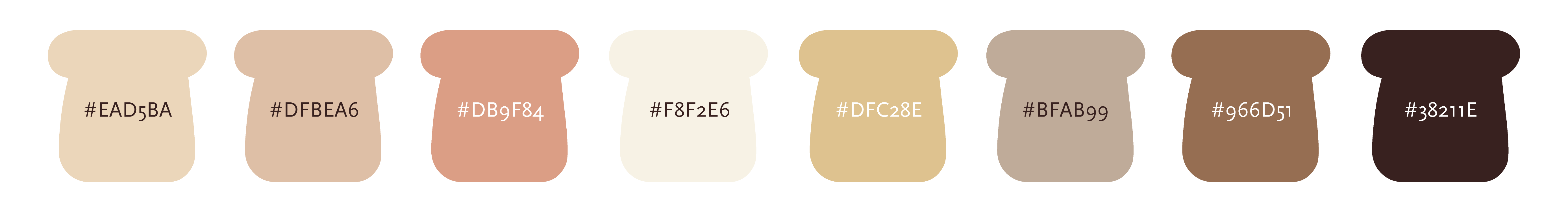
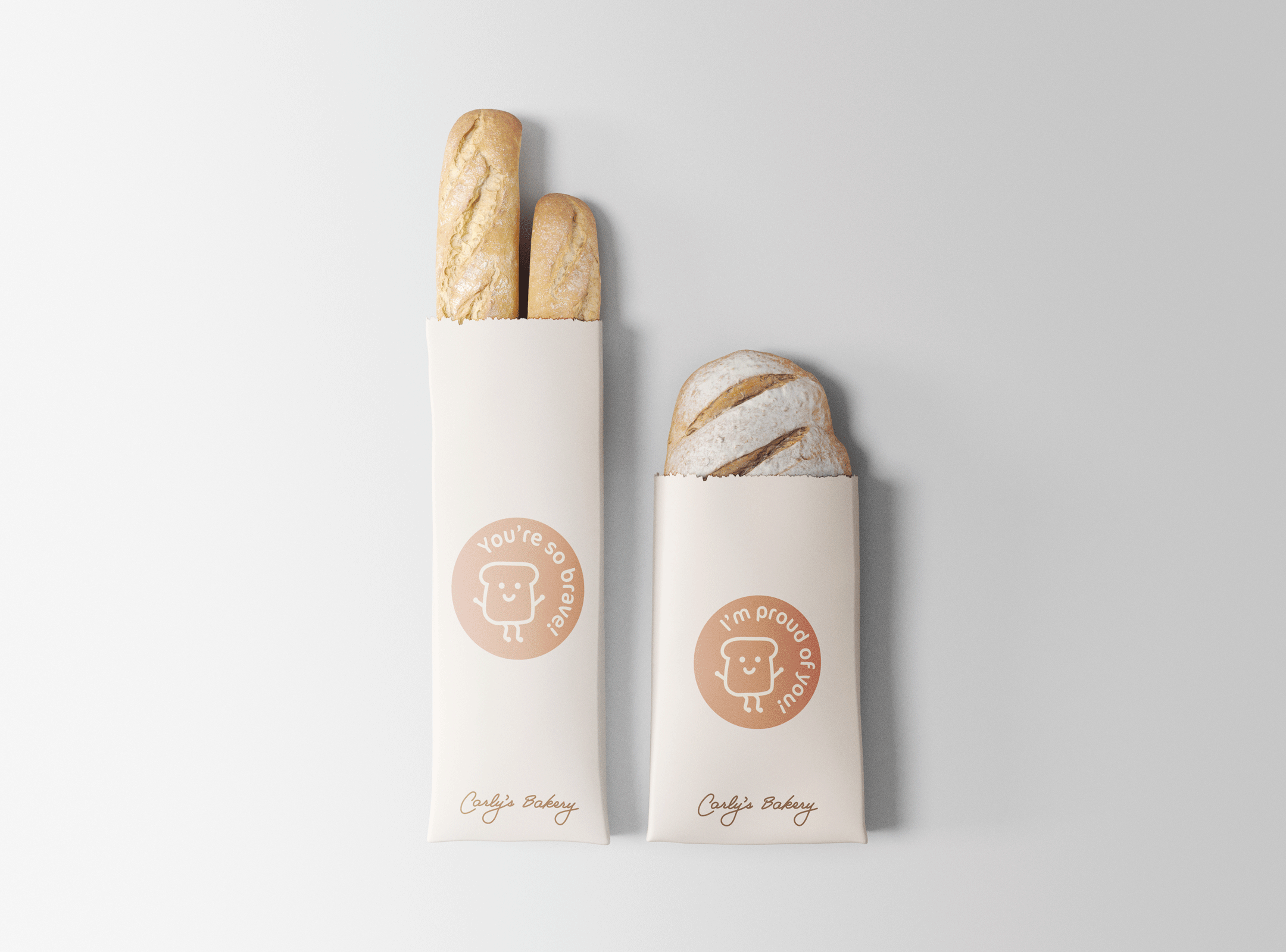
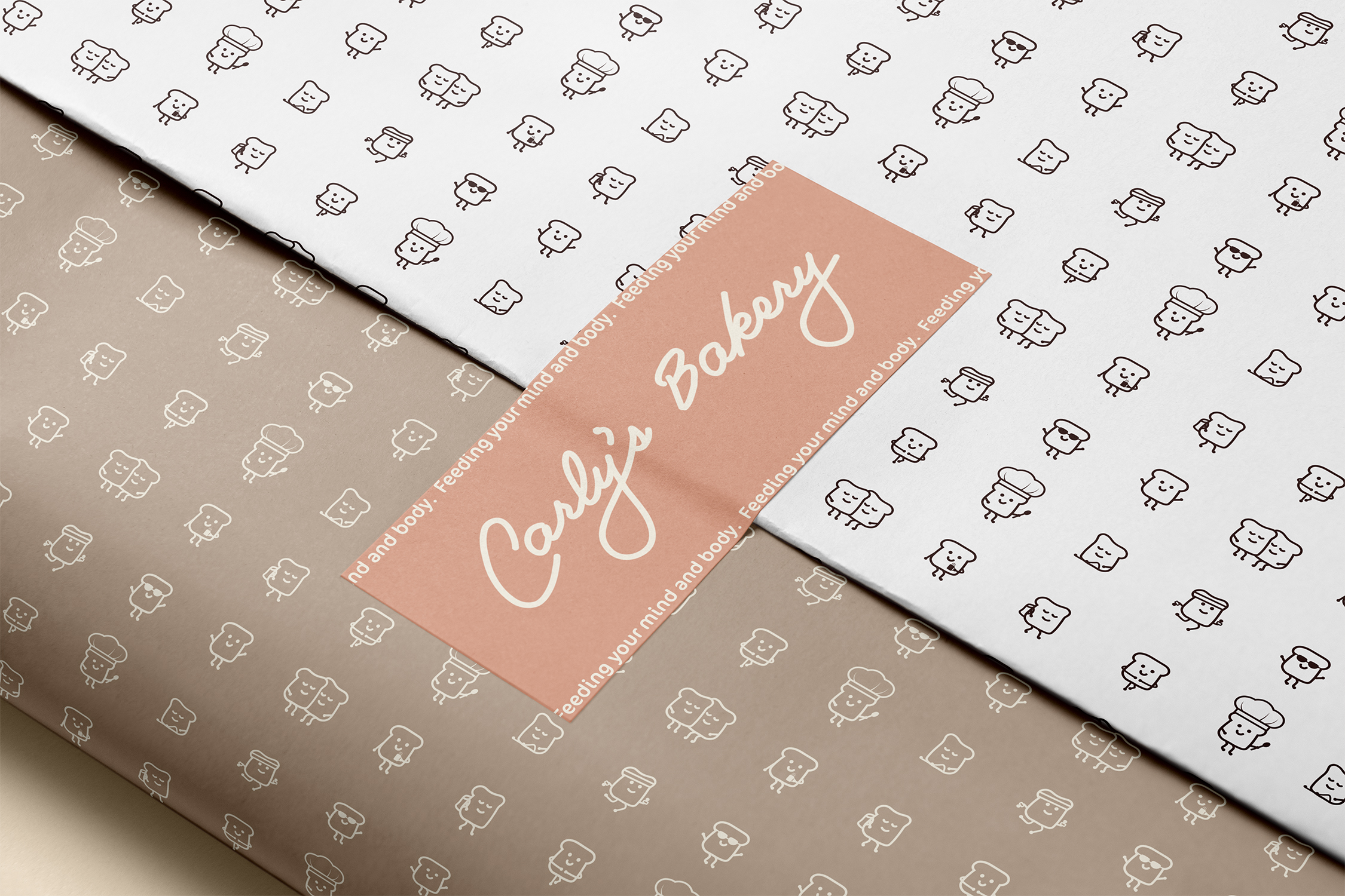
I developed a logo, brand tagline, color palette, mascot, and typography as well as several pieces of print material for this bakery. The brand’s personality is homey and warm so for colors I chose a range of browns, yellows, and pinks. I also chose typefaces with rounded and soft features to emphasize the brand personality. In addition to this I developed a character, or mascot, for the brand which is a piece of toast. This mascot would be used in marketing the mental health aspect of the bakery and serves to make the process more casual rather than intimidating.
Software
Skills
Print Design
SOCIAL MEDIA DESIGN
Packaging Design
Brand Identity Design